Sunday, August 12, 2012

Berry boxes and baskets


Karen and I had these old wooden berry baskets sitting in our booth since October. For those of you who don't know, that's ever since we've been open! They were cute, but I guess no one has any use for berry baskets these days. Well, you wouldn't want to put berries in them, but come on, they're cute enough to put other nick nackie stuff in. Anyway, one day while searching through Pinterest I happened upon  Moonbeams and Fireflies. Ann, had found some old berry boxes and put some graphics on them from The Graphics Fairy. 
It was so cute I decided I had to do that too. I have to say though that I had some guilt about coping someone's idea so blatantly. But then I thought...isn't that what Pinterest is for? Hopefully you agree, because here they are.

I made them for the most part like Moonbeams and Fireflies did. First I whitewashed them using a light grey paint. (I guess that's greywashing), but I used my heating tool to adhere the images. I think M and F used modpodge. The weaved baskets were pretty hard since I didn't have a solid base for the entire graphic, but they still came out OK. Here they are individually.
other side of box 1
one side of box 1


one side of box 2


other side of box 2


This one was long so I used some French Ephemra. I was worried about the crack in the basket, but it actually makes it look authentic.

On the back I just used Paris

More french ephemra. I put Paris on the back of this one too.


front

front

front

back of the last 3

Sunday, July 22, 2012

1914 Rawleigh's Almanac


 I love these old almanacs. I bought a bunch of them at an auction recently and I was reading some of the stuff written inside. Some of the things they said are really funny. I thought it would be fun to share some of the pages with you.


Tuesday, July 17, 2012

frenchie grey side table

I just completed this tiered side table with a french graphic on top. I first painted the entire table a light grey. Then I painted the edges vintage white. It's hard to see the white from the picture, but it looks really cute.

I got the graphic from the The graphic Fairy, and enlarged it in mirror image to fit my table at blockposters.com.

There were 4 sheets of paper when it printed out so I cut the borders and taped them together.

Next I layed the graphic face down and taped it into place.

Here is the tricky part. I first used my woodworkers transfer tool. However, see the empty spots at the bottom right of the table. The heat actually melted the paint and it started to peel off. So.....after pondering what to do, I used Citra-solv to transfer the rest of the image. As it turned out I liked the look of the peeling paint so I left it there.

Next I sanded the entire table and then waxed it using Ce Ce Caldwells clear wax.
Here's the finished table.
Here's the table in the TwinPikks booth. 
Another shot at the booth


Sunday, July 15, 2012

Transfer graphics using Citra Solv

 I had these old ticking feather pillows I got from an estate sale. I decided to add some graphics to give the pillows new life.
First I washed them of course. Nobody wants someone elses drool....ick! After they were dry I carefully took the seam out of one end and removed most of the feathers. I just dumped the pillow upside down into a plastic garbage bag.

I put the graphic on using citra solv. You can find this method on The Graphic Fairy's website here.
I actually also tried to use a wood workers heating tool, but for some reason it didn't work on this fabric. Kind of bummed about that because I like the heat method better, but when you're doing this stuff you kind of have to roll with the punches. So citra solv came to the rescue on this one. After the citra solv was dry, I dumped the feathers back in and sewed the seam up. Next project....side table.

Saturday, July 14, 2012

Transfering graphics using a wood workers transfer tool


Here is my latest transfer project. I used a wood workers transfer tool to transfer an image onto some boring cream pillows. These were really easy to do. And, there was no messy goo of any kind anywhere in the project.

Things you'll need: Laser printer, woodworkers transfer tool, scissors, tape, pillow or whatever project you want to transfer to.

1. I first found an image I wanted to use from my favorite website The Graphics Fairy. I used the French Patisserie sign on the first pillow. On the second pillow I used the  French Wreath with bee graphic. I cut out the crown from the first pillow in photoshop and used it in the second pillow too.
2. My pillows were fairly large so I needed to blow the pictures up to fit a 20x20 space. I used Block Posters.com to do this.
3. Next I printed them out "mirror image" on my new laser printer. It has to be a laser printer. If you don't know if you have laser or inkjet here's a quick way to tell. An inkjet has 2 ink cartridges. One for color and one for black and white. A laser printer on the other hand has 4 or 5 toner cartridges. (if it is a color printer) It has one cartridge for red, one for blue, and one for yellow, and one for black. This is what it looked like after I printed it out.
4. Next I carefully cut the border off of one side of the paper and taped them together. Do not tape on the graphic. If you don't get all the white space off when you tape the images together you will have a little white line down the center of your graphic when you transfer it. This did happen to me, so I just dabbed a little bit of black fabric paint on it. Worked perfect.When I was done cutting and taping this is what it looked like:
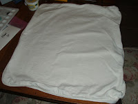
5. Next lay the graphic face down onto your pillow and tape it into place. I forgot to take a picture of this, but imagine the image above layed out on this pillow.
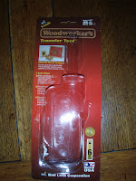


6. Plug in your woodworkers tool and let it heat up. This is what they look like. Once it's hot test it on some spare paper. It will burn the paper a little bit. Keep testing until no more brown comes off the tip. If you don't do this, and you touch it to your graphic, the burn mark will actually scorch your fabric.


7. Start heating your image. I ran the wand over the entire graphic first, then I concentrated on one edge at a time. Keep heating a section at a time until it's as dark as you want it. then peel the paper back. I would heat, peel back, look, then heat some more until I was satisfied. The good thing about this step is the ink sticks to your fabric so your paper will not move until you are ready to move it. You can heat and peel all you want and your graphic will not move.
That's all there is to it. This was one of the funnest graphics transfers I've done, and so easy. I will say though that I tried it on some different fabric and it didn't work quite as well. These pillows were just a heavy denim type canvas. So test your fabric first to make sure the heat makes the ink stick to it.

Friday, June 22, 2012

Ballard Design Giclee look alike project


 Have you ever looked through Ballard Designs Giclee prints and thought, "Hey, I could do that!" Well, I finally did it. I was looking at all the beautiful graphics from the Graphics Fairy and I saw some that looked similar to what I saw in Ballard Design. Here are the pictures in Ballard Design:
 Pretty cool huh?

Here are my "replica's".


 What do you think? Not exact, but pretty close.

Here is what I did.
1.  I bought some blank canvas. I used 8x10, but you can use any size you want.
2. I painted the entire canvas, including the sides raw ochre. (Any color of brown will be ok)
3. Once the brown was dry I painted the top a cream color.
4. Once the cream was dry I sort of came up with my own blue. (I added a hint of black and a lot of white to a standard blue acrylic)
5.Next is hard for me to explain but I sort of white washed using brown then white then blue and finally white until I got the look I wanted. I rubbed in between coats to give it an aged look.
6. My final step was to take a little piece of sponge and touch up the sides and the edges of the front with brown.

7. After the paint was dry I sprayed the entire canvas with a spray a matte varnish. This step I believe is absolutely essential as I discovered on my first attempt. If you don't protect the paint, when you get to the water stage, the paint will come off with the water. SO PROTECT YOUR PAINT! (I had to re-do the whole thing after my first attempt because I didn't do this.
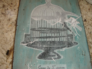
8. Now print out your image. I used several graphics from http://www.graphicsfairy.blogspot.com/ and worked with them in photoshop to get what I wanted. The birdcage is from here:  https://blogger.googleusercontent.com/img/b/R29vZ2xl/AVvXsEhD5MAP6J9KPLB-dWlSV5tQrzDqZhFXbA6fQSCzw5Mv9ZDYHoecECMKh12d4_zrMpnbix5f1TBo_2ncCxSLuqeL8vb7s_vpBo54D835-GKOf7KS2yw8761EOPnDKkvBIbYO6Oim7zsYD48/s1600/birdcageroundgfairy004b.jpg.
The chair is from here: http://www.graphicsfairy.blogspot.com/search?q=french+chair. I added some birds from various graphics and wrote out the words on each canvas in photo shop. When you print make sure it is a mirror image of the picture.
9. Next cut out your image leaving a little border. I cut out the image of the bird cage and the chair separate from the words.
10. Use a sponge brush and mod podge the front of the image. Place the glued side down on the canvas. Work out wrinkles and air bubbles with a spoon or anything else you have on hand. Be careful not to rip the paper.
11. Once the glue is dry (I left mine overnight) use a wet sponge brush and get the image wet. Once the paper is wet enough start rubbing it with your finger.
At first, large layers of paper will start to slough off.
Keep rubbing in circular motions and try to get all the residue paper off. Sometimes its hard to see it all until its dry, so try it again if there is any left after drying.
12. Once the canvas is dry spray it again with the varnish. I think any kind will work.

There you have it. A Ballard Design copy. Have fun and don't worry about mistakes. Like I said earlier, I had to re-do my first one over completely.


Saturday, June 9, 2012

First graphics project

 After seeing so many people on Pinterest using graphics to repurpose old ugly stuff I decided to give it a try.I found this old lap tray collecting dust which I thought was the perfect thing to use on my first project.  I forgot to take before pictures, but this is basically what I did.
1. painted the whole thing white
2. found this French Cacao Ephemera Graphic  from the Graphics Fairy (love love love this site)
3. enlarged it using the free website called Block Posters
4. I printed the graphic out then taped some carbon paper on the backside of the graphic.
5. I taped the graphic to the lap tray and traced the graphic using a ball point pen
6. Next I simply painted the outline. (no artistic talent required)
7. Once the paint was dry I very lightly used antiquing medium to give it a slightly aged effect.
8. Lightly sanded the top
9. Spayed the entire tray with matte acrylic polyeurethene.
Voila - my finished lap tray. Next project - putting graphics on some off white, boring pillows.